%201.png)
.png)
.png)

Keep it simple, Make it easy to read, Instantly recognizable, Communicate what the company does, Ensure it works across any background or format.
I am thinking about evolving the ConnectADtv logo, and I would like your input.
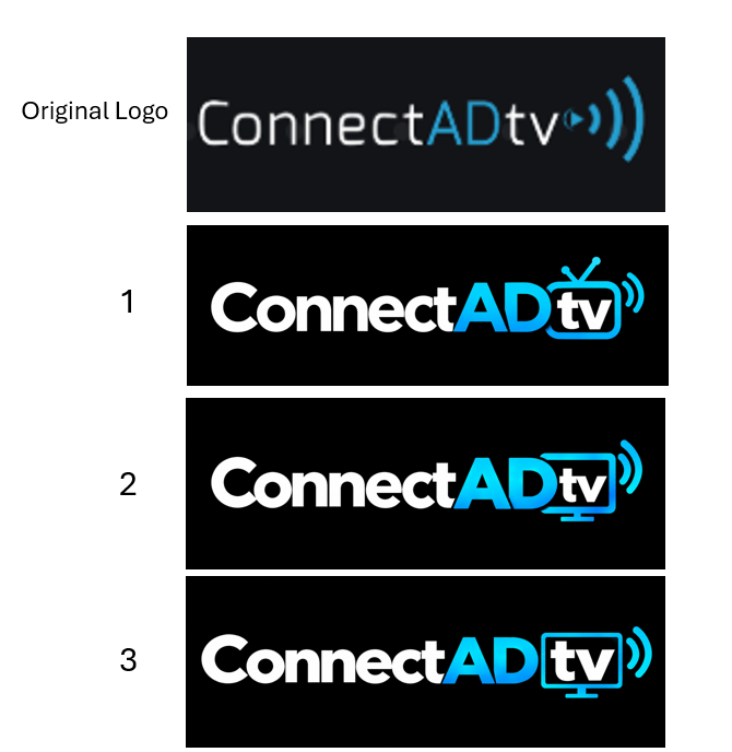
Below is our original logo from 2018, along with three new concepts. Which one do you think hits best?
When I launched ConnectADtv eight years ago, I needed a logo, so I built one. I am not a graphic designer, but I’ve always held a few core principles about what makes a good logo
Keep it simple
Make it easy to read.
Instantly recognizable.
Communicate what the company actually does.
Ensure it works across any background or format.
Now it is time to evolve, not a complete redesign.
I want to keep our original DNA, but modernize the execution so it’s even cleaner and instantly communicates Connected TV and streaming.
The new concepts all feel like ConnectADtv, but each handles the "TV" element a little differently.
Which one works best: #1, #2, or #3?
We help agencies and businesses plan, buy, and measure CTV | OTT advertising with full transparency and proven results.
ConnectADtv
4209 Deepwater Lane
Tampa Florida 33615
© 2026 ConnectADtv. All Rights Reserved.
.png)